Designing with a retro diner vibe is like hosting a costume party on your Canva dashboard. It’s a little kitsch, a lot of fun, and somehow—magically—it makes your creative projects look like they taste better.
So whether you’re designing a flyer for your friend’s Rockabilly baby shower or creating Instagram posts for a café that still says “WiFi is down, talk to each other,” this guide will help you channel that juicy, jukeboxy charm with style.
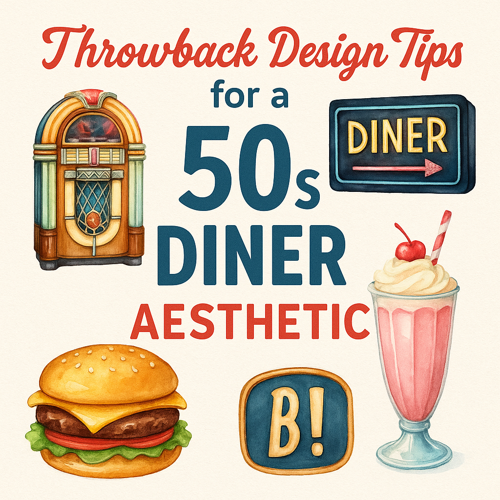
Also, you’re going to want this Watercolor 50s Diner Clipart Set—44 PNGs of burgers, booths, milkshakes, and neon signs so glorious, you’d think you were on a date with the Fonz.
🍔 Understanding the 50s Color Palette
(The only time ketchup red and mint green are best friends)
1. It’s All About the Contrast
The 1950s were not subtle. This was an era where lipstick matched your car, and your kitchen matched your shoes. Think cherry red paired with pastel turquoise. Butter yellow and creamy peach were accents, while chrome silver added that shiny, stainless-steel diner edge.
2. Go Bold, Then Balance
Use bright reds and mustard yellows to make a statement, but balance them with ice cream tones—mint green, baby blue, and cotton candy pink. It’s like your color wheel just walked into a soda shop and ordered everything.
3. Think Materials, Not Just Colors
Incorporate the look of chrome, vinyl, and Formica into your palette. Metallic gradients, leather-textured backgrounds, or checkerboard tile patterns will instantly scream “Yes, I’ll have the malted, please.”
And in case you’re feeling overwhelmed, the KoalafiedArt 50s Diner Clipart Set already does the heavy lifting—each image uses these tones beautifully, and there’s not a single shade that doesn’t work.
🎶 Pairing Fonts with Diner Clipart
(Because the wrong font can ruin your entire root beer float)
1. Script Fonts that Swing
Think Lobster, Pacifico, or anything that looks like it belongs on the window of a beauty salon that also sells milkshakes. Script fonts capture the friendliness of diner culture—curvy, informal, and a little flirty.
2. Block Fonts with Bite
Pair script with a sturdy retro sans serif like Bebas Neue, Norwester, or ChunkFive. These bold typefaces ground the softness of the watercolors and are perfect for headers like “BURGER NIGHT” or “OPEN 24 HOURS.”
3. Avoid Fonts that Scream 2024
No modern geometric fonts. No minimalist chic. If your font looks like it belongs on a Scandinavian skincare label, kindly ask it to leave the diner.
The font + clipart pairing rule: if you wouldn’t eat a chili dog next to it, don’t design with it.
🎨 Creating Vintage-Inspired Social Media Graphics
(Or: How to make your Instagram feel like a soda fountain)
1. Lead With a Snack
Use diner clipart as the focal point. A smiling burger, a frothy milkshake, or a pink jukebox grabs attention faster than hashtags ever will. Frame your image like a menu special—centered, bold, and mouthwatering.
2. Don’t Overfilter the Fun
Retro designs look best when they pop. Keep the backgrounds clean or textured like paper or linoleum. Try not to smother them with trendy filters unless you’re going for “vintage through an ironic 2020s lens,” which is a look but not this look.
3. Layer with Text Wisely
Add simple text overlays: “Try Our New Sundae!” or “Back to the 50s!” Use curved text paths for that old-school menu feel. Keep it playful but legible, because no one wants to squint at a sign about fries.
Need graphics that feel exactly like this? I say again: get the Watercolor 50s Diner Clipart. They’re Instagram-ready in the best way.
🖼️ Moodboarding Your Diner-Inspired Project
(A fancy word for “Pinterest but with purpose”)
1. Gather the Classics
Start your board with photos of real 50s diners: red stools, checkered floors, carhops in cat-eye glasses. Add album covers, soda ads, and movie stills from Grease (even if technically it’s 1978 pretending to be 1958, it still counts).
2. Add Your Clipart Set
Download your watercolor diner PNGs and place them on the board as anchors. They’ll help define the vibe you’re working toward—whether that’s “wholesome sock hop” or “sassy vintage burger stand.”
3. Look Beyond the Diner
Incorporate textures (like paper napkins or leather booths), objects (roller skates, ketchup bottles), and patterns (starbursts, atomic dots). You’re not just designing something—you’re creating a visual time capsule that smells faintly of grilled cheese.
Bonus points if you name your moodboard something like “Greasy Spoon Dreams” or “Pastel Meatloaf Paradise.”
🍒 Parting Thoughts (and Fries)
Designing with a 50s diner aesthetic is like throwing a party for your eyeballs. It’s loud, it’s friendly, and it absolutely insists on ketchup with everything. You get to play with color, character, and a pinch of kitsch, and at the end of it, you’ve made something that feels like a jukebox came to life and gave you a hug.
So whether you’re branding your side hustle soda bar or just decorating your digital planner like it serves fries, lean in. Go bold. Go pastel. Go full diner.
And while you’re at it, download the Watercolor 50s Diner Clipart from KoalafiedArt. It’s everything you didn’t know you needed—until now.
Now go on. Get out there and design something that would make Elvis proud. 🕺🍔